The Summary
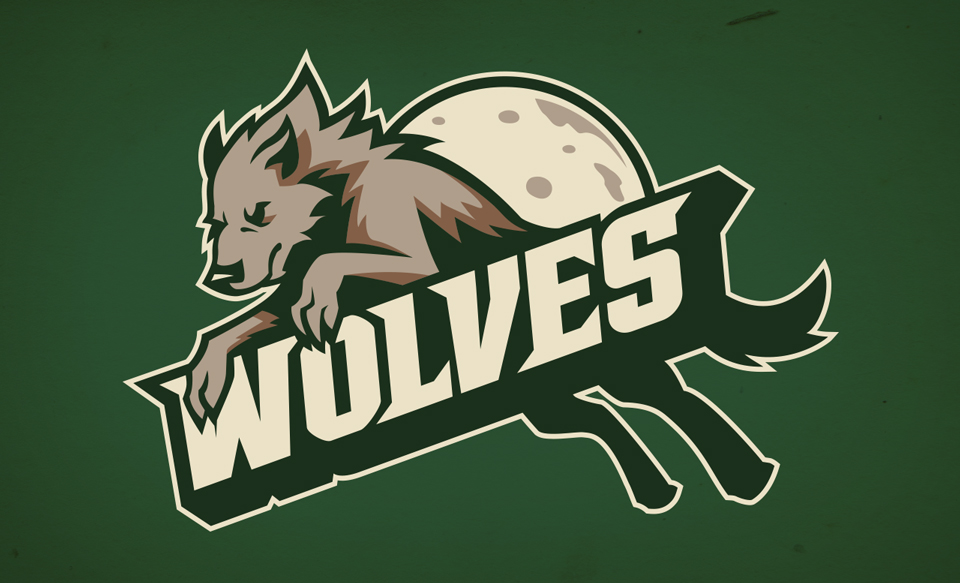
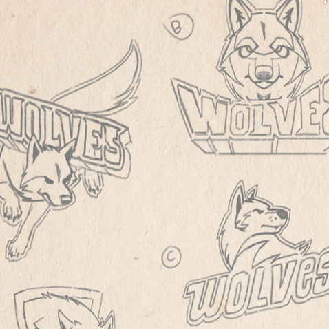
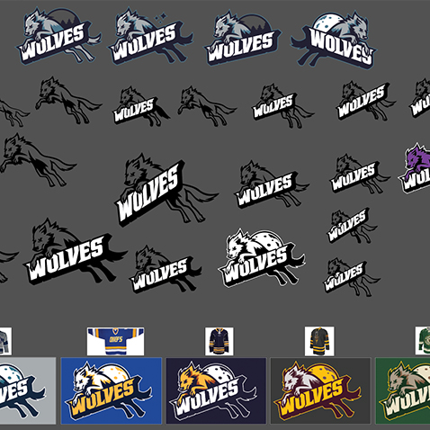
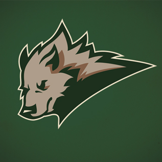
The project for the "Wolves" hockey jersey was a very close one-on-one interaction between myself and the client. It began with a handful of loose sketch compositions. Working alongside the client, the sketches went through layers of revisions, until one composition was decided upon. That sketch was brought into Illustrator to vectorize and further the concept with a variety of possible harmonizing backgrounds. There was a high attention to detail varying from things like the direction of the tail for the best visual flow to the exact skewed angle of the text.
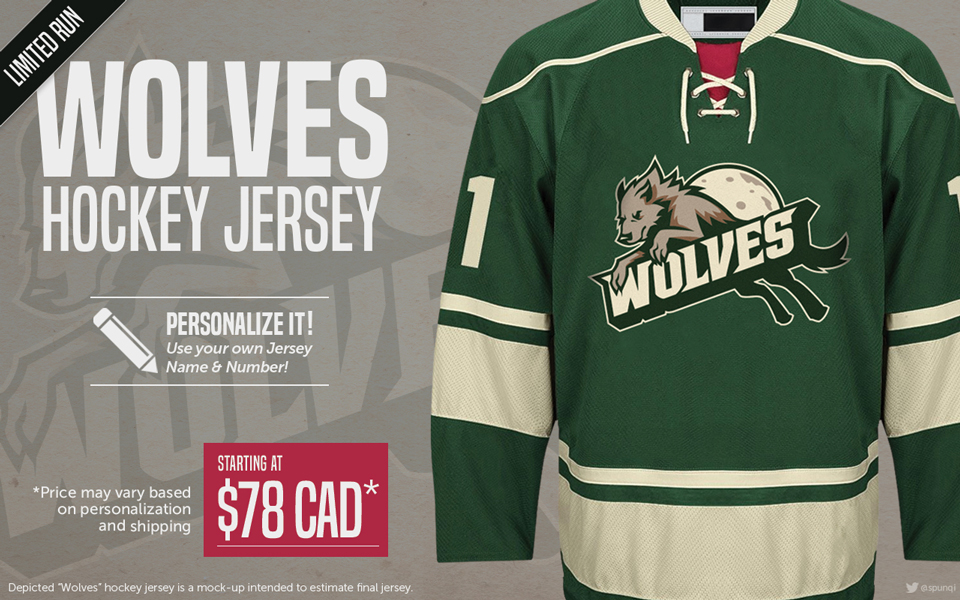
From there, a variety of color schemes were experimented with, using standard hockey color combinations, until the final design was selected and cleaned up. Then the finished logo was brought into photoshop, and mocked up onto a jersey with the fitting colors.
Then an online promotional advertisement was created using the mock up, keeping a clear visual hierarchy, prioritizing the headline, jersey, and price. A "limited run" dog-ear banner was placed over the headline to mark a subtle amount of urgency, and the typography was kept concise, clean, and clear to allow for easy reading through social media skimming.
Tools: Adobe Illustrator and Adobe Photoshop
