The Summary
Modern Macaroon is a specialty baking service, paying a contemporary homage to the classic french confection — the macaroon. It's a vibrant, assertive, clean, and inviting place of toothsome delicacies that is just as exciting as the people who eat them.
There are five major components to this project: logo design, business card, promo & email blast, package design, and an online web banner.
Tools: Adobe Photoshop and Adobe Illustrator
Logo Design
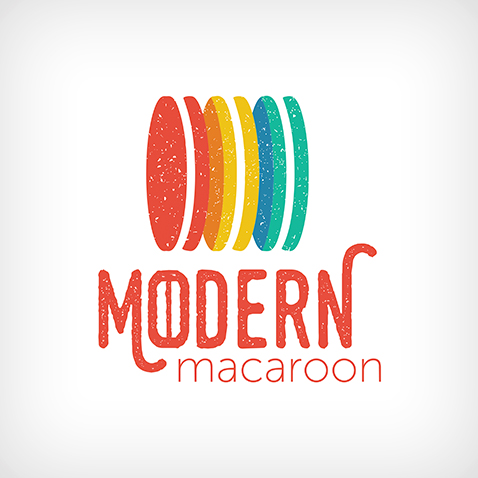
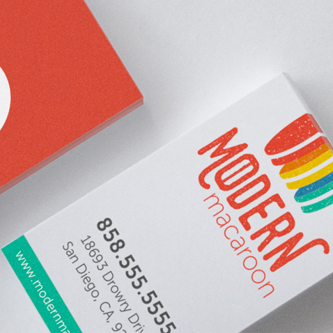
The Modern Macaroon vision was very clear in its description, so the first thing I knew I wanted was a really exciting and strong color palette. From there, I played with patterns of minimalistic and simplified macaroons. I wanted the logo to be versatile but always distinguishable. The Modern Macaroon symbol can be used and recognized on its own. The words "Modern Macaroon" contains a stylized macaroon as the "o" in "modern" for, albeit subtle, product reinforcement.
Business Card
Among the multiple business card concepts created, this vertical and simple design was chosen. There's no watermarks, lines, or borders. The backside of the card uses the Modern Macaroon red, to be eye-catching from afar. The logo was designed to work well while cropped at a specific point through the top for bleeds, as shown on the front of the business card.
Promo & Email Blast
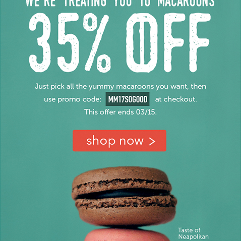
There are two parts to this section: the promotional ad and the email blast design that the ad goes into. The promo's priority was to advertise a 35% discount and the "shop now" as a call to action, coupled with a more subtle promo for their "Taste Of Neapolitan" macaroon combination. While illustrations were considered for promos, I decided teasing the taste buds with good photography would be a better hook for establishing a customer base. The original photo was manipulated in photoshop to have the macaroons stand out more vibrantly, and for the background to be tinted to match the logo and company branding.
Wrapping the prominent promotional ad, is the simple and clean email blast design. The email blast had to keep the simple and clean design theme, and pedestal the promotion while still providing helpful links to the user that don't visually compete with the ad.
Package Design
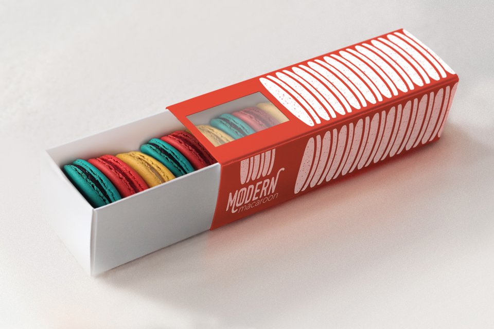
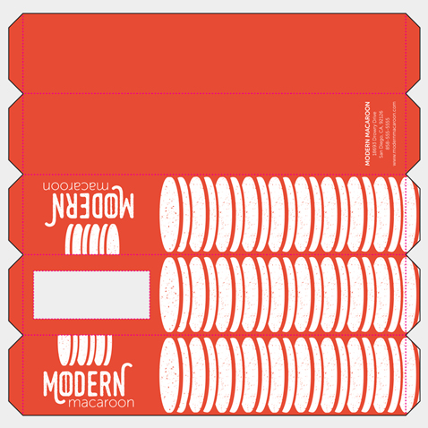
The package for the macaroons is a slide-out tray box with a sleeve. There were three key considerations I wanted to take when designing this: unify the branding, ensure the orientation of the box is obvious to prevent the macaroons from spilling when being opened, and design the package to be fun to carry. To unify branding, the three main logo colors were borrowed to make three colored versions of the package design. They're very bold colors, so they were used in a bold way. The logo's imagery was used to create a simple pattern.
Macaroons are delicate treats. It's important for a box of this design to make its orientation obvious, to prevent the macaroons from spilling upon opening. The words of the logo are kept readable on the sides and the topside of the box has a window to peek into the macaroons of the box, which doubles as an aesthetically pleasing and appetizing feature. I made sure to keep the borders of the window thick enough to maintain structure of that end of the box, to make sure the macaroons were safe from crushing. The underside is left blank with the exception of the box color and contact information. You always know which way is up on this box.
Through photoshop, I took a photograph of a box, and digitally applied the Modern Macaroon package design. Then I took another photo I had taken of macaroons and photoshopped it into the box, making sure to keep the reflected color of the macaroons on the inside of the white tray. I added the window on top of the box, then duplicated more macaroons to have showing through the window. Then I painted in the background and added matching noise so areas I had painted.
Web Banner
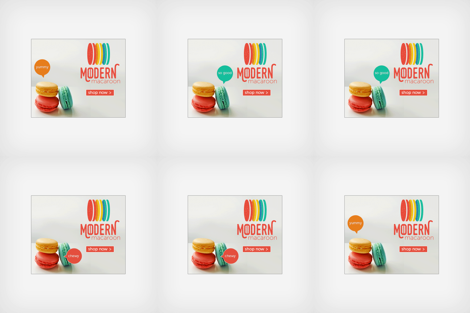
There's a fine line between "obnoxious" and "eye-catching" with animated web banners. I wanted to make sure the Modern Macaroon web banner fit in the latter category. Within limited space of 336x280, a web banner standard, it was important to keep the logo, call to action, and photograph free of clutter with a good sense of visual hierarchy. The animation is kept simple without being distracting. Through photoshop, the macaroons were changed to the colors of the logo, the background removed then painted, and the shadows were enhanced with colors to reflect the new colored macaroons.
